
- CollegeSchool of Pre-Degree Studies
- CourseUAL Foundation Diploma in Art and Design
- Graduation year2025
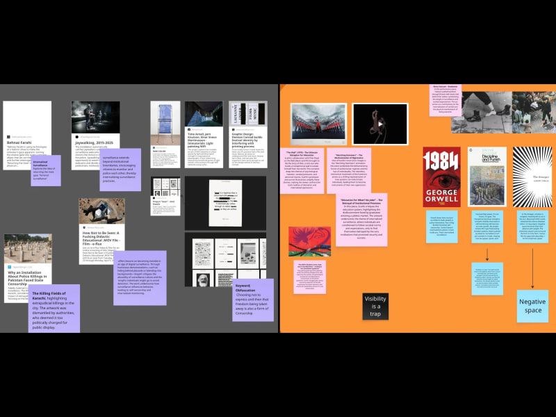
Interdict is a typeface born from surveillance; not external, but internal. What began as a study of censorship in Pakistan, inspired by voices like Sarmad Khoosat’s, shifted into something more personal during the recent India–Pakistan war. As polarized media shaped public belief, I started questioning my own truths. Was I being honest with myself, or just repeating what I’d been conditioned to accept?
Drawing from Foucault’s Discipline and Punish, Camus’s The Stranger, and the visual language of Gerald Scarfe and Mona Hatoum, this project investigates how constant observation by systems, people, and ourselves alters our identity. Interdict distorts Helvetica, the “neutral” voice, into something anxious and redacted.
Final work
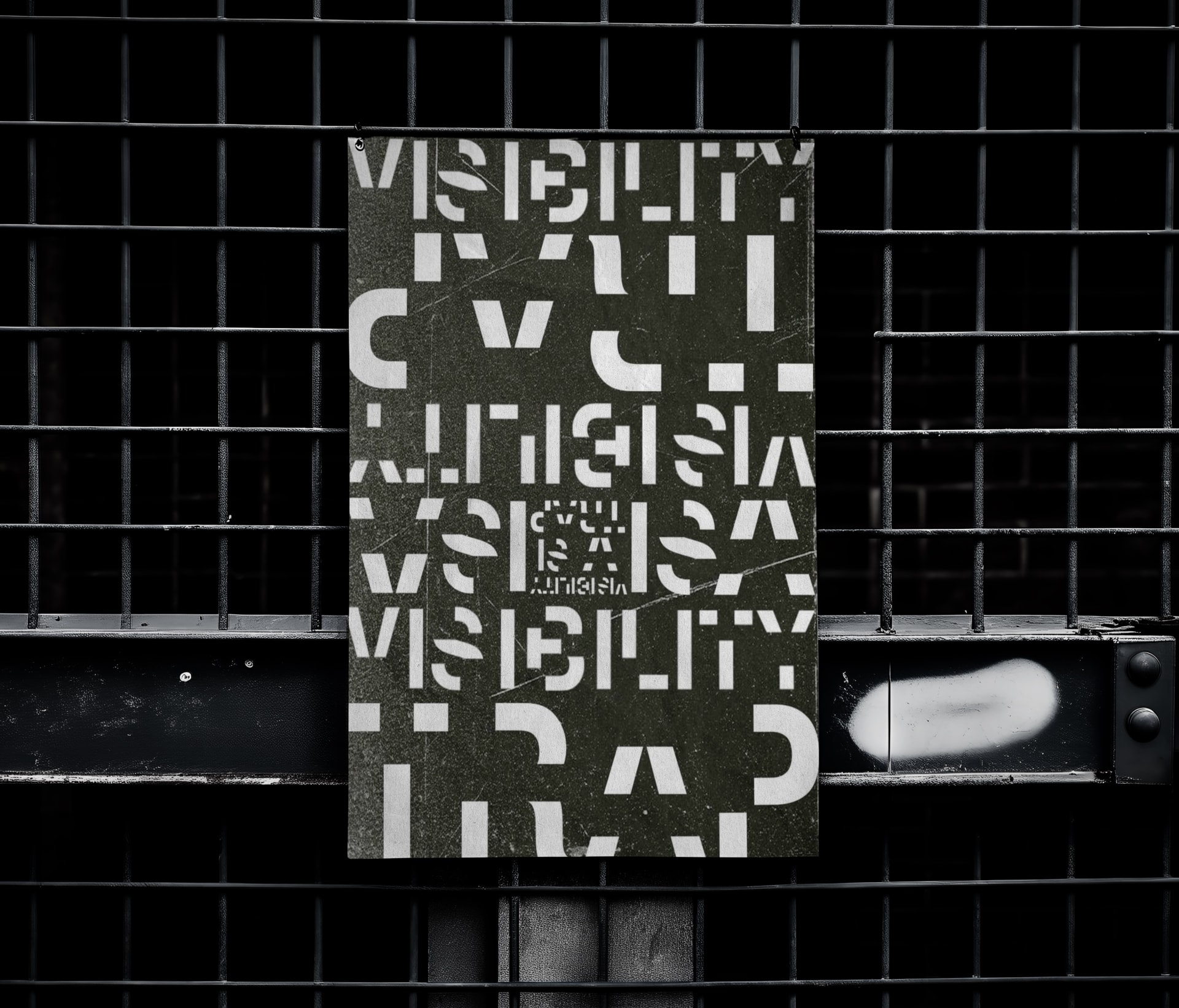
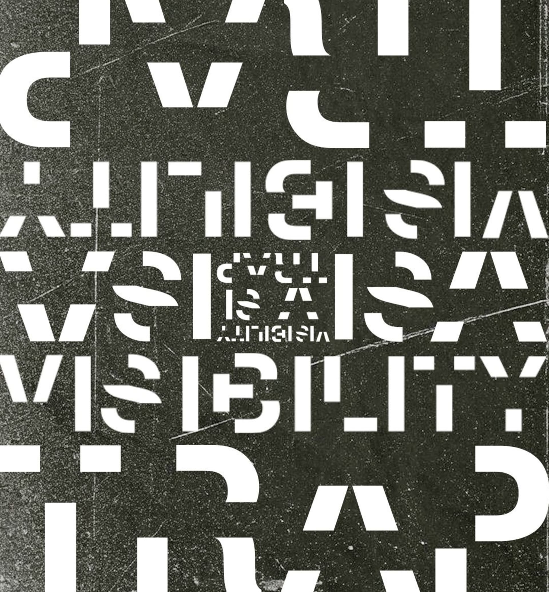
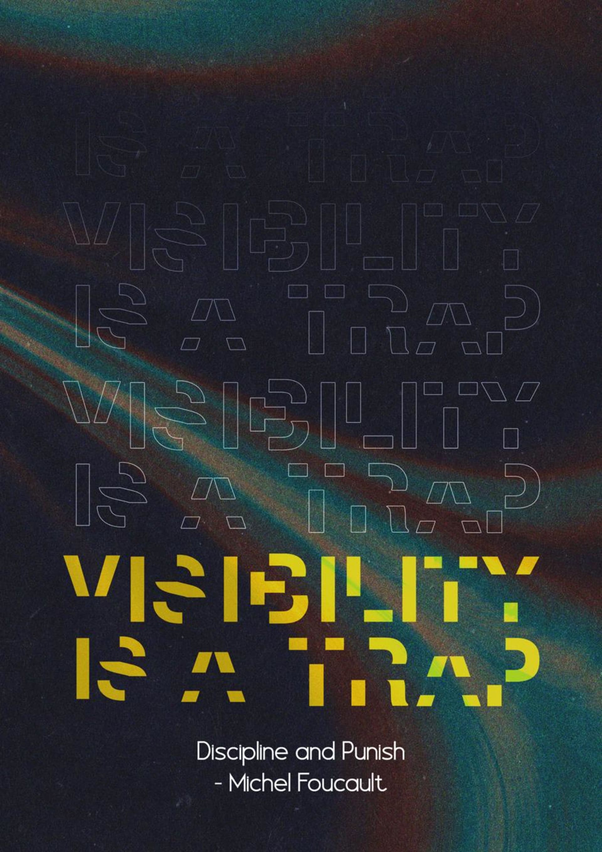
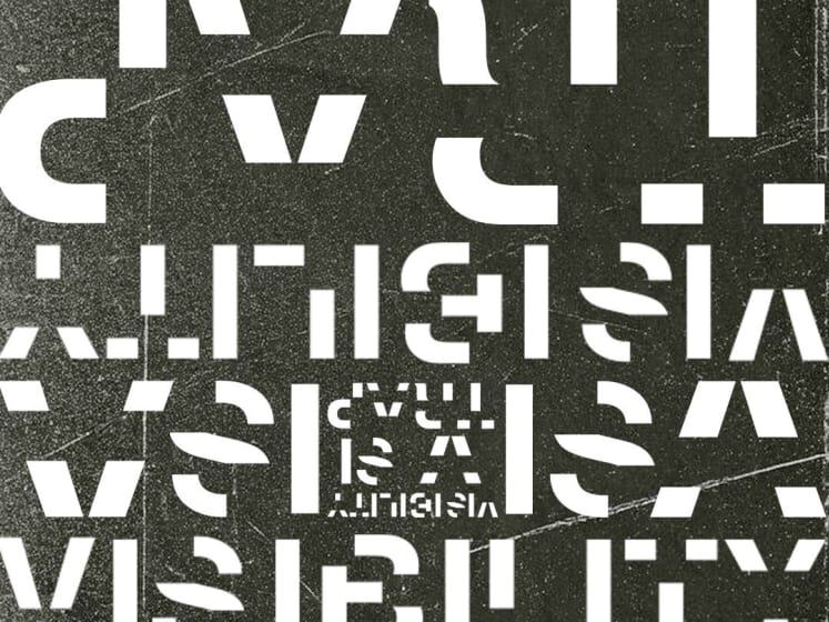
Visibility is a trap
“Visibility is a trap.” Foucault’s words used in the typeface. Born from erasure and redaction, the letters echo panoptic control fractured forms shaped by what's missing. Just like the watched inmate begins to watch themselves, this design speaks to how we edit ourselves under invisible systems.
This poster is a visual interpretation of the quote. The composition deliberately oscillates between chaotic freedom and sudden restriction, guiding the viewer’s eye across the canvas only to confine it sharply at the centre. This central zone, a dense, closeted core, serves as a metaphorical and visual trap. A moment of arrest that embeds itself into the viewer’s memory like a glitch in perception. The overall layout mimics the rhythm of a looping barcode; systematic yet fractured, underscoring themes of internalised surveillance. Surveillance becomes style, and silence becomes structure.
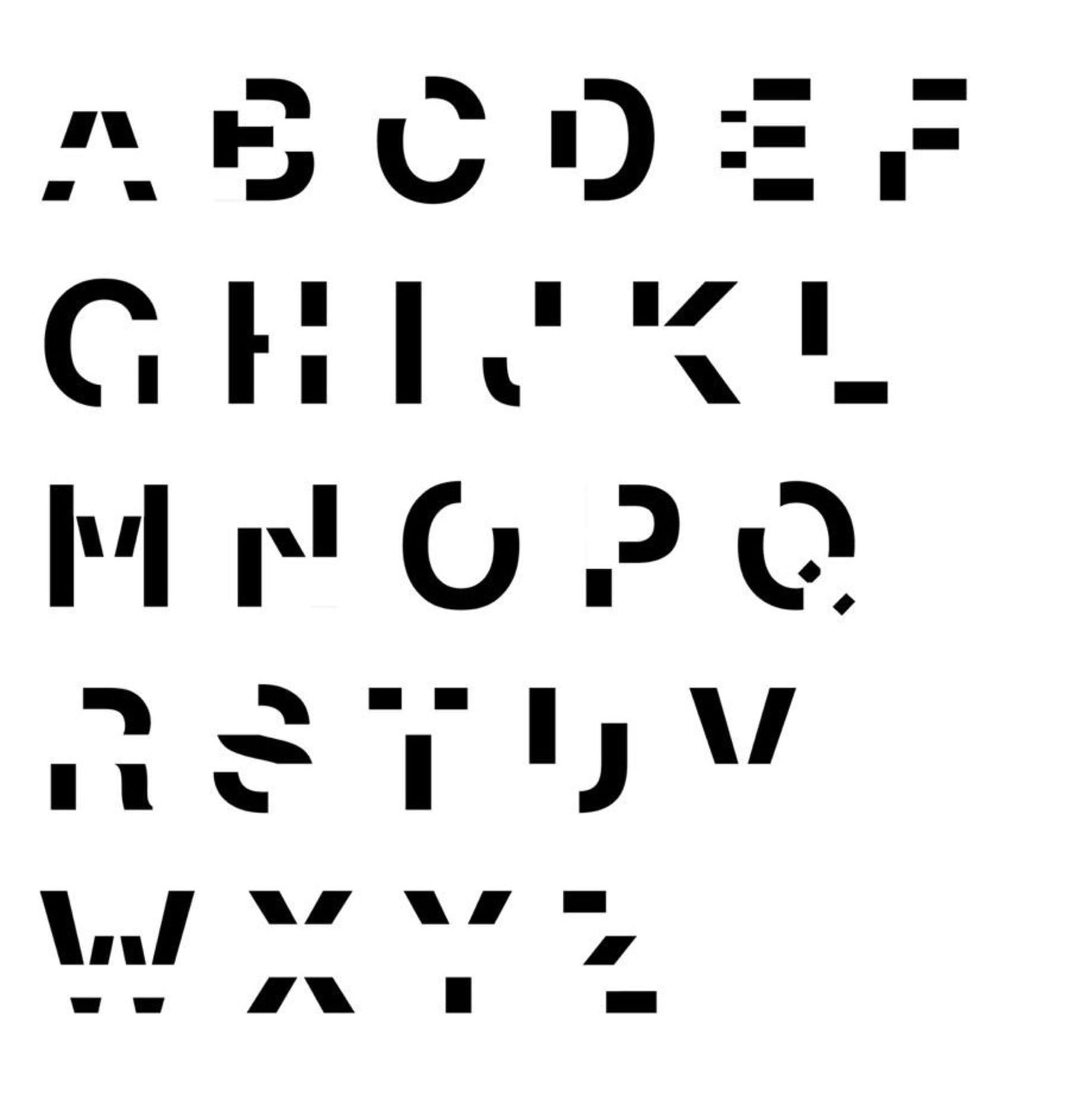
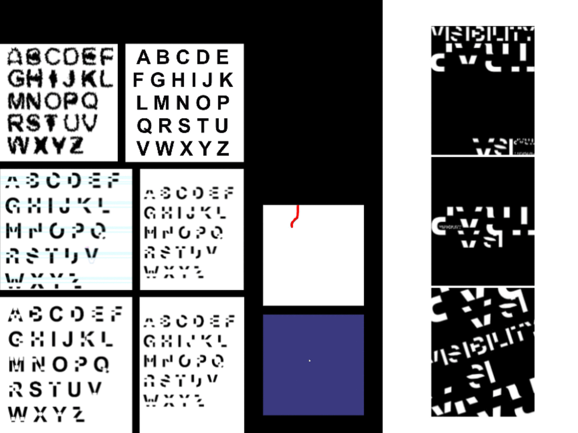
Interdict
Origin Font: Helvetica
(used intentionally for its association with neutrality, modernism and mass standardization (metaphor for default brain)
Conceptual Core:
Interdict is what happens when Helvetica gets watched.
A clean, rational system redacted as a result of constant internal monitoring
Visual Charactersistics:
Base structure: Helvetica skeleton still vaguely present, its memory remains
Line intersection: Sharp, cutting lines bisect the glyphs, redaction
Weight imbalance: Certain parts overcompensate, symbolizing overcorrection.
Perfect for Projects dealing with censorship, internal conflict, psychological distortion, obfuscation and societal control
Not meant to be legible, communicates the discomfort of being watched; even by yourself
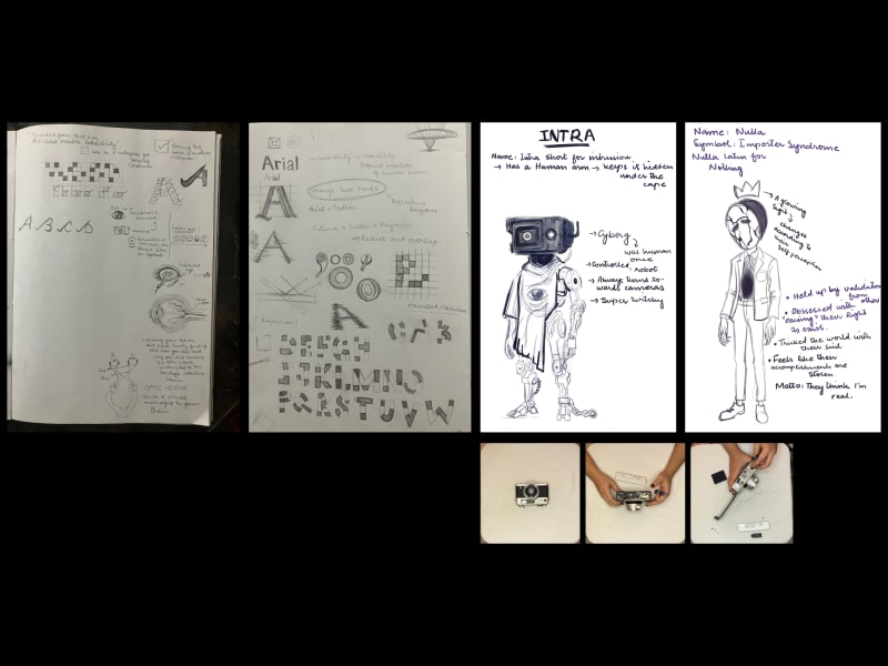
Book Cover
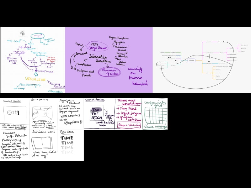
Research and process
Share this project
A link to this page has been added to your clipboard